Saturday 28 September 2013

Remember that Hallowe'en box?

Time sure flies, doesn't it?  Some weeks ago I blithely told you that I would be posting the instructions for the Hallowe'en box that we made during my Open House.  Of course the Blog Hop got in the way and myriad other posts.  I guess it's finally time to play catch up and write the post about that cute Hallowe'en box.

I think the reason everyone loved making it is because it looks great but took very little fuss and bother to make.  Isn't that a perfect combination?  Everything should be this easy to make!

We begin with a Kraft Box.  What do I like about the Kraft Boxes?  They're a great size, small but at 3 1/2" x 3 1/2" x 2 1/2" they're not so small that you can barely fit anything into them.  They're easy to decorate.  You can make them as complex and fancy or as cute and simple as you wish.  They're really affordable.  How often can you pick up four boxes for only $3.50?

For the Hallowe'en Box we take the Kraft Box but do not assemble it.  Taking a ruler, I line up one side of it with the bottom of the box and use a pencil to make a line first on one side and then on the other side of the flattened box.  Don't worry about the pencil line because it disappears.


The next part is up to you.  Using the Witch's Brew Designer Washi Tape, I lined the design of my choice up below the pencil line and adhered it all the way around the box.  Then I took another design and lined that up above the pencil line and adhered that all the way around the box.  I did the same above the second line of Washi tape with a third design.


The Washi Tape makes it so easy to put a striking design on the box.


It still isn't time to assemble the box yet.  It's easier to decorate the top lid of the box while it's flat.  For that I cut a 3 1/4" x 3 1/4" piece of Basic Black cardstock.  I rubbed that with my Embossing Buddy to remove any static electricity from the cardstock and then stamped the skeleton from the Toil and Trouble stamp set over to the right hand side using my Versamark ink.  Then I applied my Whisper White embossing powder and heat set the image.  I love the detail in the stamp, don't you?


Using a piece of Pumpkin Pie cardstock, I heat embossed the Trick or Treat stamp from the Tags 4 You stamp set using my Basic Black embossing powder.  I love the fact that this stamp set comes with a matching punch and can be bought as a bundle.  Using the Label Bracket punch, I cut out the embossed image.  Next, I used the new Chevron Border Punch on a scrap of Pumpkin Pie cardstock to get three chevrons which I adhered to the lid. Then I used the Ticket builder punch to cut two tickets from the Witch's Brew Designer Paper and adhered those to the lid as well.  Finally I adhered the cut out "Trick or Treat" using dimensionals.


I love all the elements on the lid of the box, especially the skulls in the Designer Paper and the way they compliment the embossed skeleton.

And that is all there is to making the Hallowe'en box.  It seems like a lot when you're reading all my steps but everyone at the Open House was thrilled with how easy it was to make this project.


It would be a wonderful gift, with treats inside, for a teacher or co-worker, wouldn't it?

Sunday 22 September 2013

Thanks!

Remember the banner that I made for the Blog Hop?  Well, once the photos were taken and the Blog Hop was over I had a banner lying there, nagging at me every time I looked at it.  Apparently it wasn't prepared to be put away somewhere until the next time I had a work shop or Open House.

I don't have much empty wall space in my Crafting Room.  Either I have bulletin boards up or framed projects mounted or magnetic sheets mounted for my never-ending supply of framelits and thinlits.  Looking around the house, there really wasn't a wall onto which I wanted to mount a banner, no matter how well I thought it turned out.

And then I spotted the metal word sculpture "Home" that has been above the bay window in my living room for the past few years and I knew where "Thanks" was going to be hanging.


Too much light coming in through the window, even with my cellular blinds blocking most of it.  But you get the idea.  I like the colours and the size of the banner even better than the much smaller metal "Home".


A closeup of the banner against the colour of the wall and you can see how well the colours of the banner compliment my room.   Maybe it was a good thing that the banner wouldn't stop nagging at me.

Wednesday 18 September 2013

Meeting the Challenge 3

I'm going to share another Colour Challenge.  This challenge was for the following colours:


These are lovely colours but again, I wouldn't have reached for them on my own.  Actually I was so involved in getting ready for my Blog Hop that I was going to skip the challenge (lack of inspiration can do that) but I suddenly had one of those "lightbulb" moments.  Love that!  It's as good a feeling as waking up inspired.  But I digress.

I had made a card a few weeks back with a diagonally cut front and thought it would work well for this challenge.  Of course I had to make a few changes to the previous design because---well, I'm just like that. 
The previous design had a diagonal "flip" square.  You can see what I mean with this card:


This was also part of a Colour Challenge.  The design of the card, however, is what I liked and wanted to adapt for my new challenge.

If you want to make a card like the above, this is the template for cutting.  When you compare it to the template for the second card, you'll see what I mean about adapting the design.


This is how those templates look when they've been cut and folded:

First card
Second card

Both cards are fun to make, but I wanted to have a "frame" around the images for the second card and that is the reason for the change in template.


This is the card that meets my Colour Challenge and that I made using the second template.  I wanted the frame so that the leaves appear to be coming up out of it and also so that the pennants at the bottom have a spot to come out of as well.  

The petals of the flower are all cut with the Mosaic Punch.  The bottom eight which you can just see slightly are cut from Soft Sky cardstock while the top eight are cut from vellum cardstock that has first been stamped using the Mosaic Madness stamp set and Soft Sky ink.  I used my bone folder to give some curve and dimension to the vellum petals.  The pennants were stamped first using the Hearts a Flutter stamp set with, respectively, Soft Sky ink, Baked Brown Sugar ink and Garden Green ink.  After using the Hearts a Flutter framelit to cut the pennants out, I stamped them all in Basic Black ink using one of the stamps in the Petite Pairs set.

Another challenge met.

Monday 16 September 2013

Meeting the Challenge 2


Everyone has their favourite colours and colour combinations and I'm no different.  Yes, I do own a lot of colours of cardstock.  Do I use them all?  Let's just say that out of the current colours, I usually wind up replacing only about eight of them during the year.  And those eight usually get replaced several times.  Since there are 40 active colours, that shows you how much I lean on certain colours.  Yes, I do use the rest of the colours but usually only as accents.  I have to force myself to use a different approach to colour combinations and that's where the colour challenges come in.

A colour challenge is where a person posts a challenge with, usually, three colours that should be the primary focus of the card.  Yes, you can use Whisper White and Very Vanilla (or a tiny bit of another accent) but in moderation, ensuring that the colour challenge is met.  I've joined a colour challenge in one of my groups to force myself out of my comfort zone.

I've already posted the results of one colour challenge a few weeks back and am going to post two more today.  Once challenge was to use the following colours:


Those are not colours that I normally work with together, although I do like all three colours.  They're definitely among my preferred colours.  I sat on the challenge for a few days, leaving the three colours lying on top of each other, thinking that seeing them on my work table constantly would somehow give me inspiration.  Actually it must have begun to work subconsciously because I woke up one morning knowing what I was going to do.
This is a simple sunburst using the three colours.   I made the sunburst by gluing the strips to a base.  Then I stamped words from the Fabulous Phrases stamp set on each strip using my White Craft ink pad.  I helped it to dry with my heat tool because the craft ink takes a while drying, but it's worth it for the wonderful "pop" of white.  Then I ran the piece through my Big Shot using the Chevron embossing folder.
My base cardstock was Gumball Green.  The next layer is Naturals White cardstock and the next is Midnight Muse.  I adhered the embossed piece to the top area of the Midnight Muse and adhered a strip of Gumball Green ribbon to hide the "seam" before adhering the Midnight Muse to the Naturals White.  Finally I stamped the bottom area of Midnight Muse with Celebrate from the Seasonal Sayings stamp set using the White Craft ink pad again.  As a final touch I tied a bow through a Simply Pressed clay button using the White Baker's Twine and adhered it to the centre of the sunburst using a glue dot.

Challenge met!
* * * * * * *
The next challenge I want to share  is the one using the following colours:

I really enjoy all these colours and the moment I saw them I knew what I wanted to do.  I had just received my order from Stampin' Up! which included the new Circle Card Thinlits die.  What better way to use it than to meet my new colour challenge?

I decided to use the Island Indigo as my base cardstock with the Strawberry Slush as my next primary colour and the Soft Suede as my accent.  Of course I wasn't going to use the new thinlits die the way it was meant to be used.  I envisioned a longer card and so used the full 8 1/2 " width of the cardstock and cut the other measurement to 5 7/16" which precisely fits inside the thinlit, avoiding the "blades" top and bottom.  The trick is to have everything fit into the thinlit, avoiding the blades top and bottom and at the right side.


You can see just how I avoided the cutting edge of the thinlit by putting the paper over the edge on the right side.  This way you still wind up with the right sized card, the circle flip flop portion and an extra piece to folder over.  

This is the card I wound up with.  


You can see how I put a layer of Designer Specialty Paper on the front fold and another pattern of it on the back fold.  I also used Strawberry Slush for the scalloped circle on the flip portion of the card.  That scallop was made using a die that comes with the Circle Card Thinlits die set.  The die for the Island Indigo cut-out on the back fold also came with the set.  Actually there are nine dies in addition to the large card thinlit so the set is very affordable.


The reason I avoided the right side cutting edge is that I wound up with the card looking like this:


That section with the sentiment and candles wouldn't have been there if I had used the thinlit the way it was designed.  

Another challenge met!


Thursday 12 September 2013

The Wacky Watercooler Holiday Catalog(ue) Blog Hop


Wacky Watercooler New Catalog(ue) Blog Hop

Welcome to the Hop from Blackfalds, Alberta, Canada

* * * * * * *
We're featuring products from the 2013 Holiday Catalog(ue)

2013 Holiday Catalogue

As well as products that have been carried over from last year's wonderful
Holiday Catalogue, and some of the Holiday Specials that are current.

* * * * * * *

If you enjoyed our first ever Wacky Watercooler Blog Hop back in July, you'll love the new Hop which focuses on the upcoming holidays.  We have some very talented people participating in our Blog Hop again. If you started somewhere in the middle or are moving through the Hop backwards, you will have come from the very talented Deborah Smart's blog, Stamp and Create.  Deborah always manages to use our products in new and exciting ways.  It's a pleasure to have her join this Hop once again.

We have Demonstrators from both the United States and Canada participating in this Blog Hop.  That's the reason for the (ue) in the Catalog(ue).  We're acknowledging the various spellings of the word, depending on which side of the border you happen to be living.

Why do we call it the Watercooler?  Well, if you've ever worked in an office, you'll know how much friendly chatting goes on around the watercooler.  Why Wacky?  We delight in our eccentricities and enjoy quite an off-the-wall sense of humour.  Wacky seems to fit the bill.

And now---on with the show!

* * * * * * *

For my first project, I'm featuring Hallowe'en.  It's a holiday that people either love or hate.  There are very few people that are indifferent to it.  I happen to enjoy it because I love going out with my grandsons while they're trick or treating.  It's usually quite cold for Hallowe'en up here in Alberta but keeping up with the boys and helping to carry their loot keeps our blood warm.

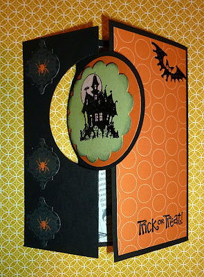
I decided to use a brand new stamp set which is part of the Best of 25 Years collection: Best of Halloween. Along with that, I used the bat from the Holiday Catalogue stamp set: Halloween Hello.  The style of card is called a Flip card or Flip-Flop card and, although it used to be quite a complicated card, it has now been made easy for any level of card-maker to create.  Why?  Because Stampin' Up! introduced the brand new Circle Card Thinlits Die.  Using the die, it was easy to make this fun Halloween card.


What I've done here, however, is to adapt the die by extending the cardstock over one end, avoiding the cutting edge, and adding an extra fold.  The front, you see, has the "flip-flop" circle which turns as you open the card.  When it's closed you see the haunted mansion.  When it's open, however, you see the sentiment.  Since I've extended the card, you also see some more of the wonderfully spooky Witches Brew Designer Series Paper.

You can also see the orange spiders on the front of the card.  These are actually also part of the Designer Paper but have been cut out using the Mosaic Punch.

* * * * * * *

This is a Holiday Blog Hop and so the next holiday project I've tackled is Thanksgiving.  Yes, it feels good to give thanks every day. Isn't it wonderful, however, to have a day set aside during the year when we gather together to share all the good things that have happened all year long and give thanks?  Somehow the "thanks" seem stronger and more powerful sent as a group. 

I love having seasonal decor.  It changes the atmosphere in the house, doesn't it?  This year Stampin' Up! has given us a boost in making our decor by providing all the necessary materials to make banners.  Since Thanksgiving is part of the Fall holidays, I couldn't think of better colours to use than the colours of Fall itself.  What is prettier, after all, than the colours of the leaves as they bid good-bye for another year.  I love the celebration of Fall!  Crunchy leaves.  Yellows, oranges, browns, rusts---all joyously cheering the end of another wonderful summer.


As you can see, I didn't choose to use the stencils for the banners but, instead, I used the Autumn Accents Bigz Die and cut out a stencil of the leaves.  Then I used a dauber to get the leaves.  The colours of the banners, which I sponged with a mix of alcohol and re-inker, are Pumpkin Pie, Baked Brown Sugar and Crushed Curry.  The colours I used to stencil the leaves were Crushed Curry, Baked Brown Sugar, Pumpkin Pie, Old Olive and Cajun Craze.  I loved the look of the banners so much that I didn't want to hide any part of them but of course I did.  I cut out some Baked Brown Sugar with my Labels Framelits and stencilled "thanks" on them.  They adhered perfectly with my glue dots.


Instead of using the supplied jute twine, I chose to use the 1 1/4" Burlap Ribbon and attached the banners to that with the safety pins from the Vintage Trinkets.  Then I added some rosettes and some leaves and there you have my Thanksgiving Banner.

* * * * * * *

I love Christmas!  I love the real meaning of Christmas as well as all the more commercial part of it.  Decorating the tree, of course, is right up there but I'm not going to post an ornament.  Cards are such fun because you get to reach out to people that you have, perhaps, not been in touch with during the year.  But I'm not going to post a Christmas card.  Before I keep going on about the things I'm not going to post, perhaps I should just tell you what I made for this Hop.  

Remember those wonderful Tag a Bag Gift Boxes in the Annual Catalogue?  They come with an acetate sleeve and are the perfect size for candies, ornaments, candles, cookies, and all sorts of items that you might want to gift a teacher or one of your friends.  Of course they're great for all sorts of occasions, but this one is going to be a Christmas gift box.

I adhered pieces of Island Indigo cardstock on all sides of the box after stamping snowflakes on the cardstock using my Silver Encore Metallic pad and the two smaller snowflake stamps from the Festive Flurry stamp set.


I filled the box with shredded white paper and then placed several little silver ornaments inside before putting on the sleeve.  Then I made a little girdle using Pool Party stamped with little silver stars.  As a final touch, I tied some Silver Ribbon around the girdle with a double bow.  I finished it off with a vellum Pointsettia stamped with the Joyful Christmas stamp set and heat embossed with Silver Embossing Powder.  I used a sponge dauber on the reverse side of the poinsettia and rubbed in some Island Indigo ink, concentrating the colour in the centre and then letting it be paler at the ends.  I stamped a second flower, doing the same, but only cut out the centre to adhere to the full poinsettia.  And in the centre of the flower, I adhered one of the gorgeous Frosted Finishes Embellishments.


If you noticed a bit of texture on the acrylic sleeve of the box, you're very perceptive.  I put the acrylic sleeve through the Big Shot in the Northern Flurry Embossing Folder.  Subtle but it makes such a difference.

Who wouldn't be happy to receive this little box?

* * * * * * *

Well that's it for my part of the Hop.  Next you're going to visit the very talented Jean Kupsh's blog.  Jean is an American demonstrator who is currently living in Germany where her husband is posted with the military.  I expect that Jean's projects are going to be absolutely awesome.  Enjoy.


 photo nextwatercoolercrockbutton.jpg


Tuesday 10 September 2013

Work delays...

I've told you that there's a new blog hop coming up on Thursday.  Of course I'm working at my projects.  It isn't always easy, however, because I have those in my house that are all too happy to put delays in my way.
Like Mei Li when I left the room for a few minutes to get a drink in the kitchen.


Okay, so I really could have moved her, right?  But Mei Li looks so very comfortable.  I can always get back to it when she moves in a while.  Fingers crossed that she doesn't drool on my Island Indigo cardstock!

Monday 9 September 2013

Guess what!

There's another blog hop coming up!  Just another couple of days to wait.

Single fun!

Stampin' Up! has done it again!  They've released a new set of single stamps that will be available until January 31st, 2014.  What is so special about these single stamps?  They're holiday stamps, which is awesome because one can never have too many of those.  But even better, one of those single stamps lets everyone make a 3-D star without "doing the math".

Remember my posts back in December 2012?  I devoted three of them to making 3-D stars but, because we didn't have a stamp or die to make one, I depended on my protractor and figuring out all the angles, right up to an eight-armed star.  You might want to see the first one which shows how to make the five-armed star.  That's the one which we're going to do today, without having to do a stitch of math.

Introducing item #134813, the Christmas Star.


Pretty, isn't it?  The design is so elegant.  Because it's a solid stamp with only the flourishes and "starburst" lines left uninked, you can make the star any colour you wish.  I decided to stamp mine using Island Indigo.
After all, that's one of the colours in our beautiful Winter Frost Specialty Designer Series Paper.


Yes, you will have to cut it out using your paper snips.  I've left a tiny border of white around the star just to tie in the interior flourishes and lines.  You can see that the star is quite a significant size.  From arm point to arm point, it measures 4 3/8".  Of course it will appear slightly smaller once it is puffed up into a 3-D object, but even then it will measure 4 1/8".

The next step, after cutting the star out, is to use your scoring stylus and run it along the lines, from the point to the indent.  You can use a ruler for this step if you're afraid you'll have wonky lines otherwise.  I put my Silicone Craft Sheet underneath to allow the stylus to leave a generous indent in the paper.


Once you have the score lines, it's easy-peasy.  Just like my tutorial in December's post, you simply make mountains with the long score line from point to centre and valleys with the short score lines from indent to centre.  And there you have it:  a gorgeous 3-D Christmas Star.

If you came to my Open House then you will have made one of these stars just for fun as a "warm-up" before we got to work on the make-n-takes.

What can you do with the star?  Let your imagination be your guide.  You've seen what I did back in December, beginning with the first star.  This time I made a second identical star and then put some dimensionals in strategic spots.


Then I matched them up carefully and they adhered together to make a wonderful double-sided star.  Can't you just imagine a few of these hanging from your tree?


I'm going to play with these and see how they look dressed up with some Dazzling Details.